
While I didn't start this blog with the intention of talking about causes, I seem to have gravitated that way frequently. So it should come as no surprise that I'm finding myself more and more drawn to people that are making a difference in one way or another. I love hearing about people who are taking great risks to create change (read about the risks Greg Mortenson has taken to educate kids in the Middle East in Three Cups of Tea) or doing small things that have big impact (such as the So-Cal Fire Poster Project). Whether large or small, risky or safe, all efforts to help others should be applauded. So I was excited to read in the latest HOW Magazine a story called "For Goodness' Sake," which highlights the efforts by various designers to make a difference. Some have done this by working pro bono full time, others have done it through small, but effective efforts on the side. It's just so exciting to see designers working with others for others.
One exciting thing about the article itself is the author's call to action for the design community as a whole. This part caught my attention in particular:
The notion of designers as problem-seekers rather than solvers is consistent with the evolution of our profession. As design has moved away from being concerned principally with form-making toward a greater involvement with the “big idea,” the tenets of design practice have shifted, as well. It’s no longer enough to be concerned simply with our ability; the fact that we’re able requires us to be responsible. That is, because it’s within our grasp to solve complex problems, it becomes necessary that we apply ourselves toward solving them.
Christopher Simmons, “For Goodness’ Sake,” HOW magazine, August 2008
The rest of the article is just as good. Find it on a magazine rack near you.
6.29.2008
Thinking outside ourselves . . .
5.16.2008
Limitations . . . what good are they?

Aimee Mullins knows a little about limitations. Amputated from the knee down on both legs at age one, Aimee could have let these limitations define her life. Instead, she chose to embrace the possibilities of freedom that these amputations allowed her. I haven't heard much of Aimee's story through the years, but I do remember her getting attention for the prosthetic legs she had constructed to help her run more effectively. She's been a leader in pushing prosthetics to a new level because she didn't want to be held back by the status quo.
Aimee recently spoke at the 2008 Art Center Design Conference in Pasadena, CA. The conference "is a three-day international gathering of entrepreneurs, thought leaders, and innovators from many fields and disciplines" that explored "the essential role of play in business, the arts, science, storytelling, technology, and more." Aimee gave an incredible speech about the power we have to tap into our differences:
"The idea of being different [is often viewed] as a negative, or as a challenge we must overcome. But—in this crowd [of creatives]—we know it’s inherently powerful. Diversity leads to diversity of ideas and problem solving, collaboration to help us to connect. It’s actually in each other’s differences that we see ourselves. We’re more alike than we are different."
. . . and the power we have to inspire ourselves to do great things:
“I often get questions of bravery, [but] I do not have any special powers. I am equipped with the same magical powers that you are, and it’s your thoughts. At some point you have to recognize the amazing engine that is the way you think. Whether you think you can or can’t, you’re right. I’ve met so many more people who are so much more disabled in their heads than I ever was by having to put prosthetics on. I think you should set wild and improbable goals."
It's inspiring speech that was transcribed by Tango, Katy, and Doug over at the conference blog. Check out Aimee's speech now. The transcript of Bruce McCall's speech is first, so you'll have to scroll down to after the second picture to read Aimee's speech. You'll be happy you did.
5.15.2008
The art of type . . .

There have been some incredible examples recently of designers using type to create pieces of art. The most notable of these is Veer's Type City prints. Each print is a little masterpiece in itself. "Each portrays an urban facet, illustrated character by character with a typeface that evokes the image itself." Fabulous—and mind-blowing at the same time.
If you're looking to create your own type art, then stop by Cameron Moll's blog before getting started. He recently created his own type art and learned a few things along the way. Thankfully, he's sharing them with all of us. Enjoy.
5.14.2008
What happens in the silos . . .

Growing up an Air Force kid wasn't always easy. Granted, there were some perks: seeing fighter planes up close, watching giant missiles take off, and touring the Space Shuttle facilities. But those perks didn't come often enough or last long enough to outweigh the downside of Air Force life: moving.
Yes, I said moving. In 18 years, I lived in 9 states, moved every 2 to 3 years, and found myself going to 3 different high schools. That was the life of the son of a man who worked for 26 years maintaining the big missiles, the Minuteman missiles we had aimed at the Soviet Union. But looking back, I realize how grateful I am for the experiences those moves provided me. I've seen—and lived in—more of the U.S. than most people have even thought about. I've dealt with moving so often that it's a natural part of life to me. But the thing I appreciate most about all of it is my dad's devotion to our family. He did everything he could to keep my family in one place as long as possible. He was adamant that his family never move during the school year—and we didn't. He made every effort to show me the exciting side of Air Force life, such as watching air shows from the runways and touring missile silos.
So I was quite excited today to come across a post at Design Observer about a subject my dad may know a little something about: blast-door art. As I understand it, blast doors are the massive, underground steel-and-concrete doors that lead into the launch control centers. Sometimes, these doors were painted with art by the people who worked inside. Tom Vanderbuilt writes, "These images in launch control centers across the United States testify to the bravado of the men (and, from the mid-1980s onward, women) of what has been called 'America’s Underground Air Force.' But they also reflect the sometimes surreal pressures faced by two-person missile crews on 24-hour duty alerts, waiting for a call to turn their missile launch keys and perhaps end civilization as we know it." These paintings were photographed by Robert Lyon with the help of Daniel Friese, a civilian employee of the Air Force, and they can sometimes be crude—or rude—but in each case interesting.
It's with great honor that I dedicate this post to my dad. Thanks, dad, for all that you have done for me.
. . . GO NOW.
5.13.2008
Simple beauty

Every once in a while, an ad stands out not for what it is selling, but for the beauty it portrays. Director Yves Geleyn's "Mother Like No Other" video is one such ad. The subdued color palette, the graphic texture-upon-texture style (created in part by scanning in fabrics), and the simplicity of idea makes this beautiful story of a beaver giving his mom a mother's day gift come to life in a moving and touching way. Enjoy it now . . .
5.12.2008
A little bit of TOC . . .

If you have ever wondered how to put a fresh face on something seemingly so bland as a Table of Contents, look no further. Jessica Helfand and William Drenttel over at Winterhouse have started a public Flikr group that showcases some great TOCs. As they say, "The purpose of this group is to create an online archive of Table of Contents pages. We begin with images from the book 'The Next Page: Thirty Tables of Contents,' compiled by the editors of Design Observer, Michael Bierut, William Drenttel, and Jessica Helfand. We encourage you to scan and upload contents pages from your own library and add them to the group's photo pool."
Check out these TOCs now . . . and then upload your best TOCs. The more we share, the more we learn.
5.11.2008
The new 007

A couple posts back, I talked about how fun it can be to see old products repackaged and made "new" again. Penguin UK does an exceptional job of this, and the publisher has recently done this again with Ian Fleming's classic 007 series. From the dramatically illustrated and—in Bond fashion—suggestive covers to the distinctive typography to turning the Penguin logo into "007," this is a fun new look for this series. Check them out here under Bond Books / Centenary Edition Hardbacks.
Colin Brush, a senior copywriter for Penguin, has a nice post talking about updating this series here. Two interesting things of note:
1. Penguin is releasing all of these books as hardcover editions to create a special set of books that gives Fleming the honor Penguin believes he's due.
2. The back cover copy is simply a quote from the book. What a great way to draw you into the book while intriguing you at the same time. I've seen this done on other products (most noticeably on the front covers of Penguin's Great Journeys series), and it always makes me more interested in the book than any sales copy that I've read.
So those are two things that stuck out to me. What intrigues you—or doesn't—about this new look?
P.S.
While checking out Penguin's 007 site, I was reminded of the other stunning Bond series from Penguin. These paperback editions are just as cool in their own way as the new hardcovers. Of course, I'm a sucker for bold typography and striking imagery. Check them out here under Bond Books / Modern Classics.
4.26.2008
UPDATE: For the greater good . . .

Not long ago, I posted about the So-Cal Fire Poster Project and the good work they're doing trying to raise money to help the victims of the wildfires that devastated Southern California late last year. As a reminder, designers and artists create limited-edition posters, work with a printer to have them printed, and sell them through the So-Cal Fire Poster Project. The proceeds will be given to the Salvation Army for the 2007 California Wildfire fund.
After posting about this, I ordered two of these posters, and I couldn't be happier with my purchases. Both posters are designed and printed beautifully, they're hand-signed and numbered by the designers, and they came well-protected in the mail. I highly encourage anyone looking to a way to give back or just looking for an incredible, limited-edition poster to check out the So-Cal Fire Poster Project. It's worth every penny—both for you and the people you're helping.
BRIGHTER DAYS AHEAD
by Greg Bennett
S.O.S.
by Robert Palmer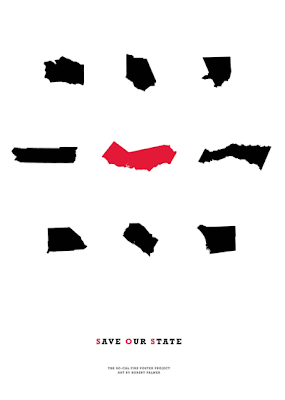
4.25.2008
Misery Lit

It's not new that tragedy sells, but it is relatively new that people's tragic stories sell—and sell well. So naturally, those books are popping up everywhere. Just look at the recent books by the father and son duo of David and Nik Sheff: Beautiful Boy and Tweak. Each tells his side of how Nik became addicted to crystal meth and the horror stories of what that has meant to their family.
Because of this recent demand for what Bookseller magazine calls "misery lit," more and more bookstores are creating special sections to showcase these books. Mark over at the Creative Review blog has an interesting story about this growing niche of products. While we could debate all day about whether this trend is good or bad, it's interesting to note Mark's take on the covers for these products. Each cover is following a specific code for this genre: scrawling, handwritten title + ghosted image of a wounded or innocent child. Just like the codes found in other genres/categories, these codes help potential buyers recognize a book as one that centers around a tragic life story. Of course, it's also creating a genre of books that all look alike. It then becomes the creative team's job to create a fresh look within these codes that helps a book be associated with the genre while also makes it stand out from the crowd. One interesting attempt at this is Nik Sheff's Tweak. From the design, it looks like the creative team had no desire to make this book appeal to potential readers of "misery lit." Instead, the creative team seems to be going after youth and young adults that find drugs alluring—for good or bad.
Thanks to Mark and the Creative Review blog for this intriguing story.
. . . GO NOW.
Inside the mind of an author . . .

Author websites can vary as much by the publisher as by the author. Most are filled with bios, a works section, screensavers, backgrounds, and other "must-haves" of today's internet world. But some stand out for what they don't offer.
Miranda July's website doesn't give you anything—except a little insight into the mind of an author. Miranda's uses a marker and a stovetop to create a clever bit of storytelling that tells you so much more about her than all the normal stuff. It's intriguing, simple, and effective. In the end, of course, it's just another ploy to get you to buy her book No One Belongs Here More Than You, but it's a fun journey anyway. And don't forget to go back to the beginning if you haven't seen that. It offers even more insight into Miranda's world.
. . . GO NOW.
Out with the old, in with the new . . .
When a new designer brings a fresh eye to an old project, the results can be amazing. For instance, take a look at these cover ideas from Nicole Peterson for Dante's Divine Comedy. They're simple, but so effective in explaining the main idea of each title. Nicole is a recent graphic design graduate from Massachusetts College of Art and Design in Boston and has this to say about her designs:
I wanted to create a set of book covers that did not use images from the Bosch Hell painting, or any images of Dante and Virgil that are normally found on covers for the Divine Comedy. I was inspired by Dante's use of mathematics and architecture in describing Hell, Heaven and Purgatory. I employed simple geometric shapes and color to represent these places, while still keeping the design simple, and allowing the reader to use their imagination when reading these vivid poems.


You can find more of Nicole's work on her flickr set.
Thanks to Veer: Ideas and Creative Review for bringing Nicole to my attention.
3.31.2008
Life Verse Design

A friend of mine just opened up a store over at Etsy called Life Verse Design. She's an excellent graphic designer who is using her gifts to create stunning works of art centered around scripture verses from the Bible. Each "life verse" is designed to specifically speak to your heart through words and imagery while constantly reminding you of "God's truth and promises in your life." You can buy framed and unframed versions of numerous verses in various sizes, so you're bound to find a verse that's right for you or someone you know.
. . . GO NOW.
3.27.2008
3 who inspire . . .
Inspiration. I get a lot of it from other artists, including the three you see here. But who inspires you? Let me know by commenting below.
SCOTT HANSEN . . .
You'd never know by looking at his work that Scott didn't go to school for design. He's found a distinct style that he loves and champions: stark simplicity mixed with bold thinking. He finds a way to beautifully express an idea through, as he says, "efficiency of form." Whatever form he chooses works for me.
. . . GO NOW.
EDUARD ERLIKH . . .
I first encountered Eduard Erlikh's work in Limited, where his work stood out because each piece looked like an incredible sketch for a top fashion designer. Except his pieces aren't sketches; they're bold, simple pieces of beauty. The organic linework, the bold watercolor painting style, the simplicity of portrayal . . . they all combine to create incredible, if sometimes risky, works of art.
. . . GO NOW.
RAYMOND SWANLAND . . .
Raymond is one of the best illustrators of science-fiction and fantasy I've ever seen. Not one piece is cliche. Each one is epic. Each one tells an in-depth story. Each one will take your breath away.
. . . GO NOW.
3.26.2008
ABC3D
This new pop-up book by Marion Bataille looks like an absolutely simple, yet inspiring work of book design. If you haven't seen the video below, check it out now. I know I'll be checking out the real deal when it releases in October.
3.24.2008
Make a small difference . . .

Looking for a way to help make a difference in our world? Then participate in the upcoming Earth Hour. This Saturday at 8 p.m., people and businesses across the globe will turn off all unnecessary lights for one hour from 8 to 9 p.m. On 31 March 2007, 2.2 million people and 2100 Sydney businesses turned off their lights for one hour — Earth Hour. So this year, the event is going global with Chicago, Copenhagen, Toronto, Melbourne, Brisbane and Tel Aviv being just a few of the cities that are participating. As of today, the Earth Hour website proclaims that 187,000+ people and 11,000+ businesses have signed up. If you're interested in turning out your lights for an hour this Saturday to help make a difference, check out the Earth Hour website.
3.18.2008
For the greater good . . .
Ever wonder how your design skills can help others? Then check out the So-Cal Fire Poster Project. Designers and artists create limited-edition posters, work with a printer to have them printed, and sell them through the So-Cal Fire Poster Project. All posters sold raise funds for victims of the wildfires that devastated Southern California late last year. The proceeds will be given to the Salvation Army for the 2007 California Wildfire fund.
My friends over at Rule29 brought this great project to my attention; you can see their contribution here. I also urge you to check out the other magnificent posters and pick one up before they're gone. You'll be glad you did.
3.16.2008
Visual Eye Candy

One of the ways I get inspired is by watching movies—especially the opening title sequences of movies. Title sequences can be an art form (think Saul Bass), and the best directors know they are so much more than a way to tell the audience who worked on the film. They can excite, inspire, and inform. They can even be mini-movies in and of themselves (think Catch Me If You Can).
There has a been a lot of buzz recently about title sequences, including a recent post over at The Screengrab that ranks their Twelve Greatest Opening Credits in Movie History. The little-film-that-could Juno has the world abuzz not just for the movie but for Shadowplay's graphic opening. And with YouTube allowing anyone to post anything, so it's usually not hard to find an opening to just about any movie you're looking for—at least until the legal guys come calling. To check out a nice collection of legally obtained sequences, head on over to Submarine Channel's Forget the Film, Watch the Titles. You can also see stills of a master's at work and learn the background behind them at Titles Designed by Saul Bass.
As for me, two recent titles had my jaw dropping open:
The Kite Runner — beautiful typography that will amaze, inspire, and make you wonder: "How did they do that?" (You'll have to rent this one; the legal guys have already taken it off YouTube.)
The Kingdom— an incredible graphic history of the Middle East that sets the stage for the movie and makes you a bit smarter in the process
Catch 'em while you can . . .
3.15.2008
Changing of the blog . . .

I started this blog as an experiment with two goals in mind:
1. Learn what it takes to create a blog.
2. Create a viable, easy-to-update portfolio.
I've since learned that it doesn't take a lot to get a blog up and running. In fact, Blogger makes it so easy to set up that I was ready to blog within 10 minutes of signing up. Of course, it look longer to tweak the layout and create all of the preferences, but when all was said and done, I had a blog of my liking up and running within a few hours. Since then, I've added more posts, learned about the cool PictoBrowser, experimented with html coding, added both Get Clicky and Google Analytical to see who's been visiting, and just had a lot of fun fooling around with the whole thing.
When it comes to the portfolio part, though, I've haven't been quite so happy for two reasons. One, I started with the idea of telling a story about each of my covers, and that's a tricky business for someone in my position. I actively work for a publisher where I have clients both internally and externally that are associated with each of the covers I write about. I would never want to accidentally say something about a product or an author that could be construed the wrong way. So with each post, there is a lot of speculation on my part about what to say, how to say it, and whether to say any of it at all.
The second reason is more practical. Practical in the sense that I want potential freelance clients to easily and quickly sort through my work. Scrolling through lots of explanation about my work isn't ideal for this purpose. Clients want to see the work and see it fast.
So, what does all this mean? I'm doing two things:
1. Creating a slimmed down portfolio site. This new blog is simple: just the work and specs for each job. Easy to update and easy to navigate. Check it out at stage3design-portfolio.
2. Changing the focus of stage3design. This blog will now become dedicated to placing a spotlight on interesting aspects of design. From book design to movie design to technology design, you'll find a bit of everything here. My hope is that it will be an interesting gathering of information that inspires you to take your designs to that infamous next level.
So . . . let the adventure begin!
3.03.2008
The Infinite Day
Science-fiction novels are few and far between in the Christian book store. Oh sure, you'll find the Space Trilogy from C.S. Lewis tucked away in a corner and few other titles manage to make brief appearances from time to time, but there are far too few of them for my taste. After all, the power of faith in God is believing in what is unseen . . . in what is yet to come . . . and in the battle between good and evil. All of these are standard elements in a science-fiction novel, and the best ones use them wisely to create a universe or a time that is just as believable as what we know today.
By all accounts, Chris Walley has created such a universe in The Lamb Among the Stars series. He's created a world that we can only dream of: A trillion people living peacefully together across a thousand worlds under the leadership the Assembly. Peace and stability reign, and evil is a thing of the past. But all that comes to an end as evil returns one day to a planet called Farholme. From there, a small band of believers must keep their faith in God while learning to fight against an evil so powerful it seems impossible to win.
The Infinite Day is the final of three books in this astounding series. The cover follows the look of the series while illustrating the Blade of Night, the evil ship created by the evil Lord-Emperor to destroy the remaining resistance to his rule. As the ship passes by a nearby sun, it leaches away the life of the sun itself, thus showing the power of this monstrous, evil ship and illustrating the danger the believers are in.
THE SPECS:
+ PUBLISHER: Tyndale House Publishers, Inc.
+ RELEASING: June 2008
+ FORMAT: 6" x 9" hardcover
+ PRINTING: 4/C + PMS 877
+ COATING: overall gloss
+ FONTS USED: Stark Bold + ITC Eras Demi
2.27.2008
Vanish
Everyone once in a while, I find myself engrossed in a book that I just can't put down. You know that feeling, the one that won't let you the put down—no matter how late into the night it gets.
Vanish is one of those books. It's a riveting, fast-paced novel that had me from the beginning and kept me reading because I just had to know how it was going to turn out. Take a look at this back cover copy:
A powerful storm.
A small group of survivors, stranded in a deserted city.
An unsolvable mystery that threatens the very fabric of existence.
A mysterious boy who may hold the key.
When everything else has vanished, only the truth remains.
If this back cover copy doesn't get you excited to read the book, I'm not sure what will. The story also delves into the possibility of two worlds or two planes of existence, thus the duality of the cover design. The trees play a large part in setting the mood for the book and reference the ominus settings the characters find themselves in. Even the gray color scheme references the dreary landscape of the deserted city and the mysterious creatures that haunt the streets. All of these elements come together to create a powerful, suspenseful cover.
THE SPECS:
+ PUBLISHER: Tyndale House Publishers, Inc.
+ RELEASING: July 2008
+ FORMAT: 5.25" x 8.5" softcover
+ PRINTING: 4/C
+ COATING: overall matte + spot gloss
+ FONTS USED: Dirty Ego
2.06.2008
America the Beautiful

Imagine a United States where politics is front and center, where political races are full of hidden secrets, and where a woman is running for president. Sound like an America we know? It may become one soon, but it's a definite reality in the new political thriller called America the Beautiful.
The primary objective when designing this cover was to show a woman running for president. Thus we made the woman candidate front and center, weaved the presidential seal into the title treatment, and brought the White House into the background. The secondary objective was to contrast the idealistic view of American politics against the hidden secrets found behind the scenes. Thus the top half is the above-board idealistic view we all hope politics will be and the bottom shows how hidden secrets are corrupting the run for the presidency. This corruption has infiltrated part of the title treatment and the White House itself.
The end result is a dramatic cover that showcases the intersection of politics, power, personality, and even the future of our country. And this final cover is the result of a collaborative effort between myself and another designer, Julie Chen. Julie and I concepted ideas together then worked back and forth on each other's work to create the final product you see above. What you see is a great example of how working together as a team can create great results.
THE SPECS:
+ PUBLISHER: Tyndale House Publishers, Inc.
+ RELEASING: May 2008
+ FORMAT: 5.5" x 8.25" softcover
+ PRINTING: 4/C
+ COATING: overall gloss
+ FONTS USED: Eurostile + Helvetica
2.05.2008
By Reason of Insanity
Courtroom battles . . . gruesome murders . . . insanity pleas . . . horrific visions . . . dramatic chases . . . and so much more fill the pages of By Reason of Insanity. It's a story that's part legal thriller, part mystery, and part edge-of-your-seat suspense. It is a story with dramatic impact, and it cries out for a blockbuster cover. In the industry, this look is created using strong author treatments, bold title stylings, and impactful imagery to draw the consumer into the suspense found within. The big names in the suspense genre—Michael Connelly, John Sanford, Richard North Patterson, Harlen Coben—use these elements consistently. For By Reason of Insanity, I wanted to show that Randy can compete on the same level as the big name authors, so the cover uses these elements as building blocks to create a unique, dramatic cover that pops off the shelf. The image itself creates a sense of intrigue and mystery because we don't know whose shadow it is—is it the hero's or the murder's? We don't know, which makes the cover more interesting—especially because we also don't know where this scene takes place. Is it a back porch? A train car? Or a boat dock? We don't know, and that makes this book fit perfectly within the suspense genre while also making it stand out from the competition.
For more about Randy Singer, visit his website.
THE SPECS:
+ PUBLISHER: Tyndale House Publishers, Inc.
+ RELEASING: May 2008
+ FORMAT: 6" x 9" hardcover
+ PRINTING: 4/C
+ COATING: overall matte + spot gloss
+ EMBOSSING: round (for title + author)
+ FONTS USED: Futura
2.04.2008
Quiet Strength

With the end of a remarkable football season now behind us, it seems only fitting that the first cover design I present here is about a man who has done so much for the game. If you follow football at all, you know about last year's Super Bowl matchup between the Chicago Bears and the Indianapolis Colts. Featuring the first African American coach to win the big game, the Super Bowl also brought into the spotlight the unusual coaching style of the Colts' head coach Tony Dungy. He doesn't feel the need to yell, curse, and threaten his players. Instead, he talks to them, works with them, and builds them up to help them succeed. Coach Dungy is known for his quiet strength, which became the perfect title for the biography Tyndale published with him last year.
When our team at Tyndale sat down to discuss this project, we agreed we wanted to create a cover that goes beyond football. Obviously, we wanted people to know he was the coach they had been hearing about, but we also wanted people to know that Tony's life is more than just football. Tony lives for his family, his friends, and helping others. We knew the story of his life could reach a much broader audience than die-hard football fans. The cover had to strike a balance between football memoir and serious biography.
With the help of a strong team, I searched through hundreds of photos looking for just the right one that showed Coach Dungy on the sidelines exuding the quiet strength he's so known for. At first, we thought we would want to show the coach without his headset. After all, the Colts hat said football loud and clear, so we thought the headset was either going to be too much football or just be too distracting. But once we found the right image, the headset had to stay. Without it, the coach didn't look like a coach; he just looked like a man in a hat. With it, he looked like the coach everyone has seen on television. So the headset stayed, I combined that with a design that says "serious biography," and we had our cover.
Personally, it was an honor to work on this project with Coach Dungy. He's truly a humble man of integrity who stands out from the crowd because he honestly cares about the world around him. I encourage you to read his memoir and see how one man can have a dramatic impact on the lives he touches.
For more about Tony Dungy and the book, visit CoachDungy.com.
THE SPECS:
+ PUBLISHER: Tyndale House Publishers, Inc.
+ RELEASED: 2007
+ FORMAT: 6" x 9" hardcover
+ PRINTING: 4/C + PMS 872
+ COATING: overall gloss
+ EMBOSSING: round (for title + author)
+ FONTS USED: Trajan + Berthold Akzidenz Grotesk
2.01.2008
what stage am I in?

AS A KID, I NEVER DREAMED OF BEING A DESIGNER. I didn't even know such a job existed. But I did know about writers because I read a lot growing up. Mostly science fiction and fantasy books, but any good fiction novel would work. Naturally, I dreamed of becoming a writer one day.God had other plans for me.
Luckily, it didn't take me long in journalism school to realize I was never going to be a great writer. But I still loved words, so I took up editing. That lasted one semester until I took my first newspaper design course. I was horrible at it, at first, but I was amazed by all of it! I went on to study newspaper and magazine design at the University of Missouri–Columbia all while keeping up with my writing and editing skills. While college prepared me well for the real world, it also taught me a valuable lesson: Great design is always based on content. I've carried that foundational principle into each job and every project I've worked on.
Coming out of journalism school, I started my career at stage1: newspaper designer. I headed to North Carolina to design and copyedit at the Greensboro News & Record. It was a fast-paced, fun job that taught me how to think fast on my feet, edit photos well, and respect the medium I was working on.
In an unexpected turn, less than 2 years later I entered stage2: magazine designer. My wife and I moved to San Francisco to work for PC Gamer magazine—she as the managing editor, me as the soon-to-be art director. (Yes, we worked less than eight feet apart every day for five years, and we're still happily married.) Working closely in a team of nine people putting out a monthly magazine taught me how to partner well with people to create the best products possible. It was also a great training ground for me to learn how to art direct, how to create successful designs (and not-so-successful ones), and how to bring new energy to the same medium time after time. After five years, I helped launch Revolution, a dance music magazine for the mainstream market. It was an incredible challenge to create a magazine from the ground up, but it taught me the value of creating a strong vision and working to achieve and maintain that vision.
It didn't take long before the pace and lifestyle of launching a new magazine demanded too much time away from my family, and that's when I entered stage3: book designer. After working on newspapers that get thrown away the next day and then creating magazines that barely last a month, I am now working on books that can last years. The best part isn't that my designs last longer; it's that the content of the products is relevant to people much longer. Tyndale publishes books and Bibles that "minister to the spiritual needs of people." That's our mission, and we work hard to make sure it's true on every product that goes out our doors. You may have heard of The Living Bible or the Left Behind series or even Tony Dungy's biography, Quiet Strength. Tyndale publishes a wide range of products that help people understand and live with the world around them. Currently, I have the privilege art directing our fiction and Bible products with a hugely talented design team. We have a team of roughly 20 people who work hard to create great work, but we work even harder to help each other every step of the way. It's a rarity to see such collaboration in a design environment, but our team atmosphere helps us create outstanding products.
This blog is an effort to show you how this collaborative environment has helped me in my designs. I don't know what the next stage of my career might look like, but for now, I'm going to be showing you what stage3: book designer looks like. I would love to hear your thoughts on any of these projects, and I hope you enjoy what's to come.
Sincerely,
Dean