
While I didn't start this blog with the intention of talking about causes, I seem to have gravitated that way frequently. So it should come as no surprise that I'm finding myself more and more drawn to people that are making a difference in one way or another. I love hearing about people who are taking great risks to create change (read about the risks Greg Mortenson has taken to educate kids in the Middle East in Three Cups of Tea) or doing small things that have big impact (such as the So-Cal Fire Poster Project). Whether large or small, risky or safe, all efforts to help others should be applauded. So I was excited to read in the latest HOW Magazine a story called "For Goodness' Sake," which highlights the efforts by various designers to make a difference. Some have done this by working pro bono full time, others have done it through small, but effective efforts on the side. It's just so exciting to see designers working with others for others.
One exciting thing about the article itself is the author's call to action for the design community as a whole. This part caught my attention in particular:
The notion of designers as problem-seekers rather than solvers is consistent with the evolution of our profession. As design has moved away from being concerned principally with form-making toward a greater involvement with the “big idea,” the tenets of design practice have shifted, as well. It’s no longer enough to be concerned simply with our ability; the fact that we’re able requires us to be responsible. That is, because it’s within our grasp to solve complex problems, it becomes necessary that we apply ourselves toward solving them.
Christopher Simmons, “For Goodness’ Sake,” HOW magazine, August 2008
The rest of the article is just as good. Find it on a magazine rack near you.
6.29.2008
Thinking outside ourselves . . .
5.16.2008
Limitations . . . what good are they?

Aimee Mullins knows a little about limitations. Amputated from the knee down on both legs at age one, Aimee could have let these limitations define her life. Instead, she chose to embrace the possibilities of freedom that these amputations allowed her. I haven't heard much of Aimee's story through the years, but I do remember her getting attention for the prosthetic legs she had constructed to help her run more effectively. She's been a leader in pushing prosthetics to a new level because she didn't want to be held back by the status quo.
Aimee recently spoke at the 2008 Art Center Design Conference in Pasadena, CA. The conference "is a three-day international gathering of entrepreneurs, thought leaders, and innovators from many fields and disciplines" that explored "the essential role of play in business, the arts, science, storytelling, technology, and more." Aimee gave an incredible speech about the power we have to tap into our differences:
"The idea of being different [is often viewed] as a negative, or as a challenge we must overcome. But—in this crowd [of creatives]—we know it’s inherently powerful. Diversity leads to diversity of ideas and problem solving, collaboration to help us to connect. It’s actually in each other’s differences that we see ourselves. We’re more alike than we are different."
. . . and the power we have to inspire ourselves to do great things:
“I often get questions of bravery, [but] I do not have any special powers. I am equipped with the same magical powers that you are, and it’s your thoughts. At some point you have to recognize the amazing engine that is the way you think. Whether you think you can or can’t, you’re right. I’ve met so many more people who are so much more disabled in their heads than I ever was by having to put prosthetics on. I think you should set wild and improbable goals."
It's inspiring speech that was transcribed by Tango, Katy, and Doug over at the conference blog. Check out Aimee's speech now. The transcript of Bruce McCall's speech is first, so you'll have to scroll down to after the second picture to read Aimee's speech. You'll be happy you did.
5.15.2008
The art of type . . .

There have been some incredible examples recently of designers using type to create pieces of art. The most notable of these is Veer's Type City prints. Each print is a little masterpiece in itself. "Each portrays an urban facet, illustrated character by character with a typeface that evokes the image itself." Fabulous—and mind-blowing at the same time.
If you're looking to create your own type art, then stop by Cameron Moll's blog before getting started. He recently created his own type art and learned a few things along the way. Thankfully, he's sharing them with all of us. Enjoy.
5.14.2008
What happens in the silos . . .

Growing up an Air Force kid wasn't always easy. Granted, there were some perks: seeing fighter planes up close, watching giant missiles take off, and touring the Space Shuttle facilities. But those perks didn't come often enough or last long enough to outweigh the downside of Air Force life: moving.
Yes, I said moving. In 18 years, I lived in 9 states, moved every 2 to 3 years, and found myself going to 3 different high schools. That was the life of the son of a man who worked for 26 years maintaining the big missiles, the Minuteman missiles we had aimed at the Soviet Union. But looking back, I realize how grateful I am for the experiences those moves provided me. I've seen—and lived in—more of the U.S. than most people have even thought about. I've dealt with moving so often that it's a natural part of life to me. But the thing I appreciate most about all of it is my dad's devotion to our family. He did everything he could to keep my family in one place as long as possible. He was adamant that his family never move during the school year—and we didn't. He made every effort to show me the exciting side of Air Force life, such as watching air shows from the runways and touring missile silos.
So I was quite excited today to come across a post at Design Observer about a subject my dad may know a little something about: blast-door art. As I understand it, blast doors are the massive, underground steel-and-concrete doors that lead into the launch control centers. Sometimes, these doors were painted with art by the people who worked inside. Tom Vanderbuilt writes, "These images in launch control centers across the United States testify to the bravado of the men (and, from the mid-1980s onward, women) of what has been called 'America’s Underground Air Force.' But they also reflect the sometimes surreal pressures faced by two-person missile crews on 24-hour duty alerts, waiting for a call to turn their missile launch keys and perhaps end civilization as we know it." These paintings were photographed by Robert Lyon with the help of Daniel Friese, a civilian employee of the Air Force, and they can sometimes be crude—or rude—but in each case interesting.
It's with great honor that I dedicate this post to my dad. Thanks, dad, for all that you have done for me.
. . . GO NOW.
5.13.2008
Simple beauty

Every once in a while, an ad stands out not for what it is selling, but for the beauty it portrays. Director Yves Geleyn's "Mother Like No Other" video is one such ad. The subdued color palette, the graphic texture-upon-texture style (created in part by scanning in fabrics), and the simplicity of idea makes this beautiful story of a beaver giving his mom a mother's day gift come to life in a moving and touching way. Enjoy it now . . .
5.12.2008
A little bit of TOC . . .

If you have ever wondered how to put a fresh face on something seemingly so bland as a Table of Contents, look no further. Jessica Helfand and William Drenttel over at Winterhouse have started a public Flikr group that showcases some great TOCs. As they say, "The purpose of this group is to create an online archive of Table of Contents pages. We begin with images from the book 'The Next Page: Thirty Tables of Contents,' compiled by the editors of Design Observer, Michael Bierut, William Drenttel, and Jessica Helfand. We encourage you to scan and upload contents pages from your own library and add them to the group's photo pool."
Check out these TOCs now . . . and then upload your best TOCs. The more we share, the more we learn.
5.11.2008
The new 007

A couple posts back, I talked about how fun it can be to see old products repackaged and made "new" again. Penguin UK does an exceptional job of this, and the publisher has recently done this again with Ian Fleming's classic 007 series. From the dramatically illustrated and—in Bond fashion—suggestive covers to the distinctive typography to turning the Penguin logo into "007," this is a fun new look for this series. Check them out here under Bond Books / Centenary Edition Hardbacks.
Colin Brush, a senior copywriter for Penguin, has a nice post talking about updating this series here. Two interesting things of note:
1. Penguin is releasing all of these books as hardcover editions to create a special set of books that gives Fleming the honor Penguin believes he's due.
2. The back cover copy is simply a quote from the book. What a great way to draw you into the book while intriguing you at the same time. I've seen this done on other products (most noticeably on the front covers of Penguin's Great Journeys series), and it always makes me more interested in the book than any sales copy that I've read.
So those are two things that stuck out to me. What intrigues you—or doesn't—about this new look?
P.S.
While checking out Penguin's 007 site, I was reminded of the other stunning Bond series from Penguin. These paperback editions are just as cool in their own way as the new hardcovers. Of course, I'm a sucker for bold typography and striking imagery. Check them out here under Bond Books / Modern Classics.
4.26.2008
UPDATE: For the greater good . . .

Not long ago, I posted about the So-Cal Fire Poster Project and the good work they're doing trying to raise money to help the victims of the wildfires that devastated Southern California late last year. As a reminder, designers and artists create limited-edition posters, work with a printer to have them printed, and sell them through the So-Cal Fire Poster Project. The proceeds will be given to the Salvation Army for the 2007 California Wildfire fund.
After posting about this, I ordered two of these posters, and I couldn't be happier with my purchases. Both posters are designed and printed beautifully, they're hand-signed and numbered by the designers, and they came well-protected in the mail. I highly encourage anyone looking to a way to give back or just looking for an incredible, limited-edition poster to check out the So-Cal Fire Poster Project. It's worth every penny—both for you and the people you're helping.
BRIGHTER DAYS AHEAD
by Greg Bennett
S.O.S.
by Robert Palmer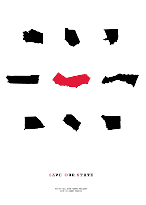
4.25.2008
Misery Lit

It's not new that tragedy sells, but it is relatively new that people's tragic stories sell—and sell well. So naturally, those books are popping up everywhere. Just look at the recent books by the father and son duo of David and Nik Sheff: Beautiful Boy and Tweak. Each tells his side of how Nik became addicted to crystal meth and the horror stories of what that has meant to their family.
Because of this recent demand for what Bookseller magazine calls "misery lit," more and more bookstores are creating special sections to showcase these books. Mark over at the Creative Review blog has an interesting story about this growing niche of products. While we could debate all day about whether this trend is good or bad, it's interesting to note Mark's take on the covers for these products. Each cover is following a specific code for this genre: scrawling, handwritten title + ghosted image of a wounded or innocent child. Just like the codes found in other genres/categories, these codes help potential buyers recognize a book as one that centers around a tragic life story. Of course, it's also creating a genre of books that all look alike. It then becomes the creative team's job to create a fresh look within these codes that helps a book be associated with the genre while also makes it stand out from the crowd. One interesting attempt at this is Nik Sheff's Tweak. From the design, it looks like the creative team had no desire to make this book appeal to potential readers of "misery lit." Instead, the creative team seems to be going after youth and young adults that find drugs alluring—for good or bad.
Thanks to Mark and the Creative Review blog for this intriguing story.
. . . GO NOW.
Inside the mind of an author . . .

Author websites can vary as much by the publisher as by the author. Most are filled with bios, a works section, screensavers, backgrounds, and other "must-haves" of today's internet world. But some stand out for what they don't offer.
Miranda July's website doesn't give you anything—except a little insight into the mind of an author. Miranda's uses a marker and a stovetop to create a clever bit of storytelling that tells you so much more about her than all the normal stuff. It's intriguing, simple, and effective. In the end, of course, it's just another ploy to get you to buy her book No One Belongs Here More Than You, but it's a fun journey anyway. And don't forget to go back to the beginning if you haven't seen that. It offers even more insight into Miranda's world.
. . . GO NOW.
Out with the old, in with the new . . .
When a new designer brings a fresh eye to an old project, the results can be amazing. For instance, take a look at these cover ideas from Nicole Peterson for Dante's Divine Comedy. They're simple, but so effective in explaining the main idea of each title. Nicole is a recent graphic design graduate from Massachusetts College of Art and Design in Boston and has this to say about her designs:
I wanted to create a set of book covers that did not use images from the Bosch Hell painting, or any images of Dante and Virgil that are normally found on covers for the Divine Comedy. I was inspired by Dante's use of mathematics and architecture in describing Hell, Heaven and Purgatory. I employed simple geometric shapes and color to represent these places, while still keeping the design simple, and allowing the reader to use their imagination when reading these vivid poems.


You can find more of Nicole's work on her flickr set.
Thanks to Veer: Ideas and Creative Review for bringing Nicole to my attention.
3.31.2008
Life Verse Design

A friend of mine just opened up a store over at Etsy called Life Verse Design. She's an excellent graphic designer who is using her gifts to create stunning works of art centered around scripture verses from the Bible. Each "life verse" is designed to specifically speak to your heart through words and imagery while constantly reminding you of "God's truth and promises in your life." You can buy framed and unframed versions of numerous verses in various sizes, so you're bound to find a verse that's right for you or someone you know.
. . . GO NOW.
3.27.2008
3 who inspire . . .
Inspiration. I get a lot of it from other artists, including the three you see here. But who inspires you? Let me know by commenting below.
SCOTT HANSEN . . .
You'd never know by looking at his work that Scott didn't go to school for design. He's found a distinct style that he loves and champions: stark simplicity mixed with bold thinking. He finds a way to beautifully express an idea through, as he says, "efficiency of form." Whatever form he chooses works for me.
. . . GO NOW.
EDUARD ERLIKH . . .
I first encountered Eduard Erlikh's work in Limited, where his work stood out because each piece looked like an incredible sketch for a top fashion designer. Except his pieces aren't sketches; they're bold, simple pieces of beauty. The organic linework, the bold watercolor painting style, the simplicity of portrayal . . . they all combine to create incredible, if sometimes risky, works of art.
. . . GO NOW.
RAYMOND SWANLAND . . .
Raymond is one of the best illustrators of science-fiction and fantasy I've ever seen. Not one piece is cliche. Each one is epic. Each one tells an in-depth story. Each one will take your breath away.
. . . GO NOW.
3.26.2008
ABC3D
This new pop-up book by Marion Bataille looks like an absolutely simple, yet inspiring work of book design. If you haven't seen the video below, check it out now. I know I'll be checking out the real deal when it releases in October.
3.24.2008
Make a small difference . . .

Looking for a way to help make a difference in our world? Then participate in the upcoming Earth Hour. This Saturday at 8 p.m., people and businesses across the globe will turn off all unnecessary lights for one hour from 8 to 9 p.m. On 31 March 2007, 2.2 million people and 2100 Sydney businesses turned off their lights for one hour — Earth Hour. So this year, the event is going global with Chicago, Copenhagen, Toronto, Melbourne, Brisbane and Tel Aviv being just a few of the cities that are participating. As of today, the Earth Hour website proclaims that 187,000+ people and 11,000+ businesses have signed up. If you're interested in turning out your lights for an hour this Saturday to help make a difference, check out the Earth Hour website.