

Not long ago, I posted about the So-Cal Fire Poster Project and the good work they're doing trying to raise money to help the victims of the wildfires that devastated Southern California late last year. As a reminder, designers and artists create limited-edition posters, work with a printer to have them printed, and sell them through the So-Cal Fire Poster Project. The proceeds will be given to the Salvation Army for the 2007 California Wildfire fund.
After posting about this, I ordered two of these posters, and I couldn't be happier with my purchases. Both posters are designed and printed beautifully, they're hand-signed and numbered by the designers, and they came well-protected in the mail. I highly encourage anyone looking to a way to give back or just looking for an incredible, limited-edition poster to check out the So-Cal Fire Poster Project. It's worth every penny—both for you and the people you're helping.
BRIGHTER DAYS AHEAD
by Greg Bennett
S.O.S.
by Robert Palmer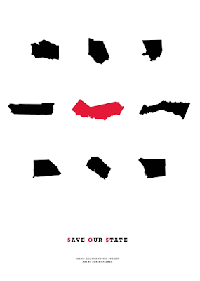
4.26.2008
UPDATE: For the greater good . . .
4.25.2008
Misery Lit

It's not new that tragedy sells, but it is relatively new that people's tragic stories sell—and sell well. So naturally, those books are popping up everywhere. Just look at the recent books by the father and son duo of David and Nik Sheff: Beautiful Boy and Tweak. Each tells his side of how Nik became addicted to crystal meth and the horror stories of what that has meant to their family.
Because of this recent demand for what Bookseller magazine calls "misery lit," more and more bookstores are creating special sections to showcase these books. Mark over at the Creative Review blog has an interesting story about this growing niche of products. While we could debate all day about whether this trend is good or bad, it's interesting to note Mark's take on the covers for these products. Each cover is following a specific code for this genre: scrawling, handwritten title + ghosted image of a wounded or innocent child. Just like the codes found in other genres/categories, these codes help potential buyers recognize a book as one that centers around a tragic life story. Of course, it's also creating a genre of books that all look alike. It then becomes the creative team's job to create a fresh look within these codes that helps a book be associated with the genre while also makes it stand out from the crowd. One interesting attempt at this is Nik Sheff's Tweak. From the design, it looks like the creative team had no desire to make this book appeal to potential readers of "misery lit." Instead, the creative team seems to be going after youth and young adults that find drugs alluring—for good or bad.
Thanks to Mark and the Creative Review blog for this intriguing story.
. . . GO NOW.
Inside the mind of an author . . .

Author websites can vary as much by the publisher as by the author. Most are filled with bios, a works section, screensavers, backgrounds, and other "must-haves" of today's internet world. But some stand out for what they don't offer.
Miranda July's website doesn't give you anything—except a little insight into the mind of an author. Miranda's uses a marker and a stovetop to create a clever bit of storytelling that tells you so much more about her than all the normal stuff. It's intriguing, simple, and effective. In the end, of course, it's just another ploy to get you to buy her book No One Belongs Here More Than You, but it's a fun journey anyway. And don't forget to go back to the beginning if you haven't seen that. It offers even more insight into Miranda's world.
. . . GO NOW.
Out with the old, in with the new . . .
When a new designer brings a fresh eye to an old project, the results can be amazing. For instance, take a look at these cover ideas from Nicole Peterson for Dante's Divine Comedy. They're simple, but so effective in explaining the main idea of each title. Nicole is a recent graphic design graduate from Massachusetts College of Art and Design in Boston and has this to say about her designs:
I wanted to create a set of book covers that did not use images from the Bosch Hell painting, or any images of Dante and Virgil that are normally found on covers for the Divine Comedy. I was inspired by Dante's use of mathematics and architecture in describing Hell, Heaven and Purgatory. I employed simple geometric shapes and color to represent these places, while still keeping the design simple, and allowing the reader to use their imagination when reading these vivid poems.


You can find more of Nicole's work on her flickr set.
Thanks to Veer: Ideas and Creative Review for bringing Nicole to my attention.